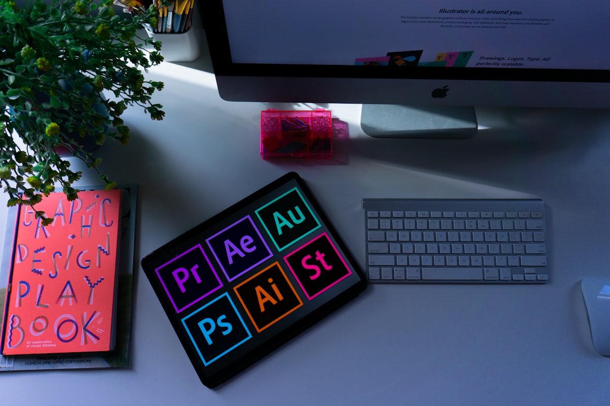
Let's be honest — a logo is not just a pretty picture. It's the single most compressed representation of your entire brand. In one mark, you're communicating your values, your positioning, your target customer, and your level of professionalism. Getting it right matters more than most business owners realize.
First Impressions Are Made in Milliseconds
Research consistently shows that people form an opinion about a brand within 50 milliseconds of seeing it. Before they've read a word of your copy, before they've explored your services, before they've decided whether to trust you — your logo has already done its job, or failed to do it.
A logo that looks unprofessional, generic, or inconsistent with the quality of your work creates a mismatch that's very hard to recover from. Visitors don't consciously think "this logo looks like it was made on a free tool" — they just feel less confident, and they leave.
 A professional brand identity signals quality before a single word is read
The Hidden Cost of a Cheap Logo
Many business owners try to save money on their logo by using a free online generator, asking a non-designer friend, or buying a $5 option from a crowdsourced platform. The upfront cost is low. The long-term cost is much higher.
- Rebranding costs money. When the cheap logo stops working — and it usually does within 1-2 years — you pay to rebrand. New business cards, new signage, new website updates, new social media assets. That adds up fast.
- Lost clients are invisible. You'll never know how many potential clients looked at your brand and decided not to reach out. That cost is real, it's just impossible to measure.
- You attract clients who match your perceived level. If your logo looks budget, you'll attract budget clients. Premium logos attract clients who expect to pay premium prices.
Think of it this way: A good logo that costs $300 and helps you win one extra client worth $500 has already paid for itself. And it keeps working for years.
What Makes a Logo Actually Good?
A good logo isn't necessarily the most complex or the most colorful. In fact, the best logos in the world are often the simplest. What makes them work is a combination of specific qualities:
- Scalability. It looks as sharp on a business card as it does on a billboard. Vector format is non-negotiable.
- Distinctiveness. It doesn't look like 50 other logos in your industry. It's ownable.
- Appropriateness. It communicates the right thing to the right people. A law firm and a children's toy brand need very different logos.
- Versatility. It works in color, in black and white, on a dark background, and on a light one.
- Simplicity. It's memorable because it's not trying to say too many things at once.
How to Get the Most From a Logo Project
Whether you're working with a designer for the first time or coming back for a rebrand, here's what makes the process go well:
Come prepared. Collect 5-10 logos you admire — not necessarily in your industry — and be able to say what you like about each one. This gives your designer a starting point that's far more useful than "I want something clean and modern."
Know your audience. Who are you trying to attract? What do you want them to feel when they see your brand? The answers to these questions should guide every design decision.
Trust the process. A good logo takes iterations. The first concept is rarely the final one. Give honest feedback and allow the designer to refine.
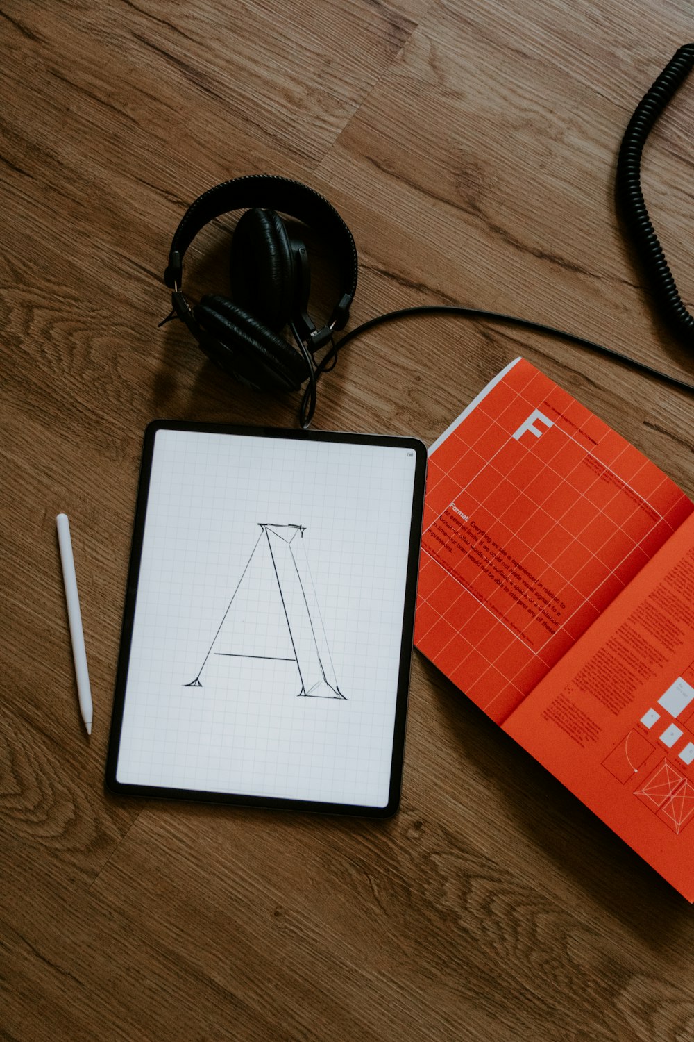 Good logo design is a process of refinement, not just a single idea
The Bottom Line
Your logo is one of the few business investments that literally works for you every single day — on your website, your social media, your documents, your packaging, everywhere your brand appears. It's worth doing right the first time.
If you're ready to build a brand that looks as good as your work actually is, Trenzy Tech does logo design as part of a full brand identity package. Start the conversation on WhatsApp — no obligation, just a chat about what you need.